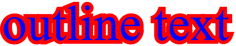
I had this issue as well, and the text-shadow wasn't an option because the corners would look bad (unless I had many many shadows), and I didn't want any blur, therefore my only other option was to do the following: Have 2 divs, and for the background div, put a -webkit-text-stroke on it, which then allows for as big of an outline as you like.
div { font-size: 200px; position: absolute; white-space: nowrap;}.front { color: blue;}.outline { -webkit-text-stroke: 30px red; user-select: none;}<div class="outline"> outline text</div><div class="front"> outline text</div> Using this, I was able to achieve an outline, because the stroke-width method was not an option if you want your text to remain legible with a very large outline (because with stroke-width the outline will start inside the lettering which makes it not legible when the width gets larger than the letters.
Note: the reason I needed such a fat outline was I was emulating the street labels in "google maps" and I wanted a fat white halo around the text. This solution worked perfectly for me.
Here is a fiddle showing this solution